
CN has been even more consistent since it first developed its wet noodle logo in 1960. Along with that decision came the radical transformation of the look of its locomotives, cabooses, freight cars and passenger coaches. Amazingly, after 50 plus years, one could put a 1960s vintage CN diesel next to a modern diesel and easily make the connection that the two belong to the same road.
The first, and longest-lasting version of CN's modern look, was the so-called safety scheme, which featured slanted white stripes against a black backdrop and a red cab. The wet noodle was plastered on the front of the engine. When you look at the modern paint schemes of North American railroads, CN was definitely an anomaly in that it did not have its corporate logo on the side of most of its diesels when it changed its look in the early 1960s.

However, there were some exceptions to the rule when CN went modern. Over the years, a number of its locomotives were painted in a nearly all-black scheme. These units had the CN logo on the side and red fronts and backs. I've often wondered why some units were given this scheme.

Another notable exception to the safety scheme was CN's fleet of workhorse SW1200s, which prowled rail yards and local spurs for decades. These units were given a mainly black scheme with the CN logo on the side. Unlike the GP9 above, the SWs were given red cabs and red trim on the front panels. This grunt and mate 1215 are pulling a load of autoracks to the St. Clair rail ferry in 1993 in Sarnia Yard.

These schemes changed in the early 1990s when CN finally decided to make a change to its look by adopting its CN North America logo, which featured the grey continent image beneath the CN logo. This look coincided with CN's first major marketing foray into the US. You can read about this paint scheme in greater detail by checking out this post in the Trackside Treasure blog. This scheme was around for a few years and it really did suggest what was to come for CN after it was privatized in 1992-93.

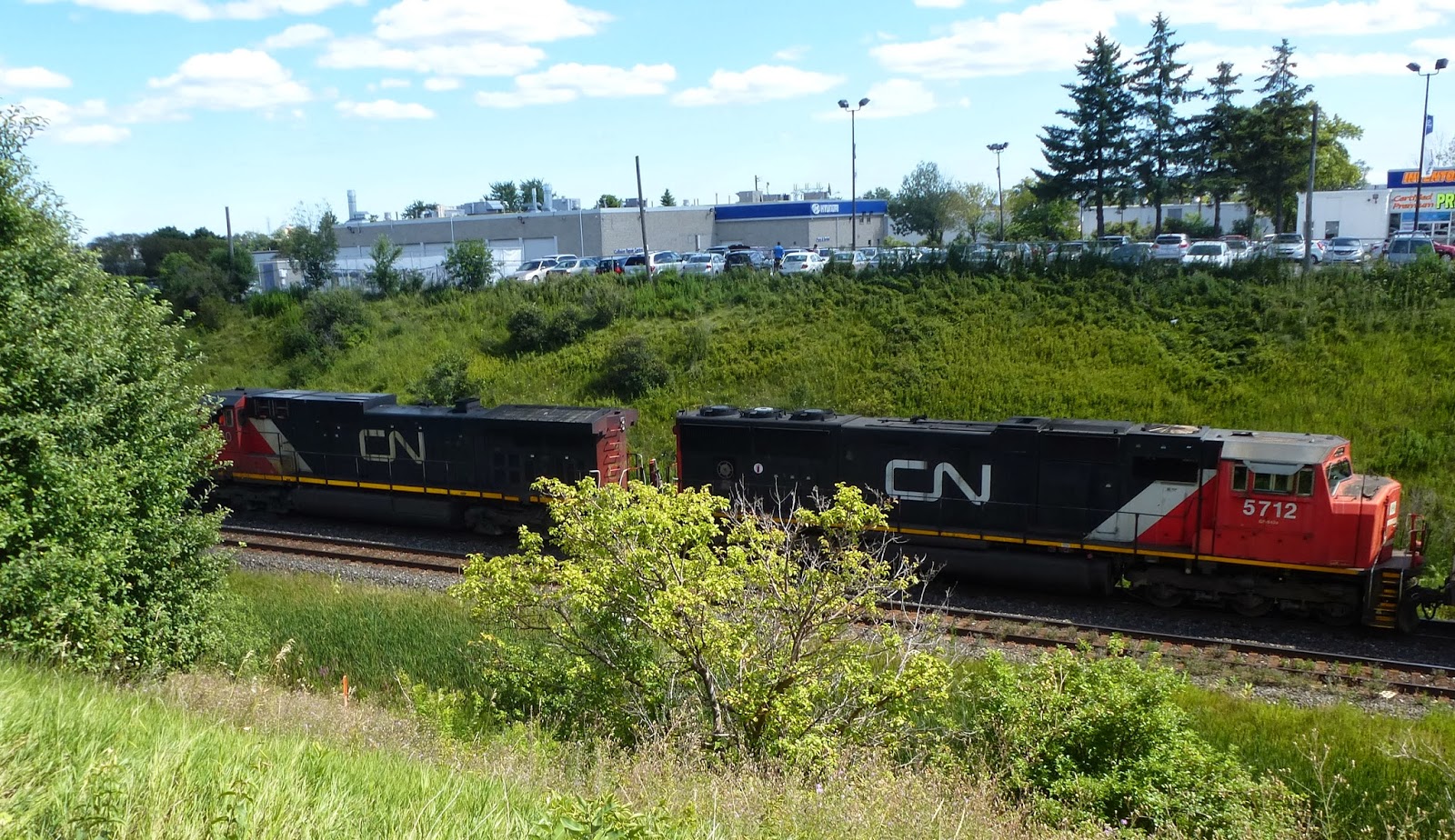
The CN North America logo didn't last all that long and was soon replaced with the look that CN locomotives sport today, like these two brutes below, shot in Markham on Aug 10, 2013. When I was looking through photos in government archives, like the two at the top of this post, I was struck by the consistency of the CN paint schemes over the last 50 years. Compared to the era before the modern logo was adopted, which was marked with constant image tinkering, the wet noodle and red/black/white scheme have been remarkably stable. It's hard to think of a railway that has had such consistency over the same period.
2 comments:
Nice post, Michael. The longevity of the CN scheme has a lot to do with the adaptability, dare I say timelessness, of the wet-noodle logo. Without that, CN would be wandering in the logo/font wilderness like CP has been.
Thanks for the shout-out re: the CNNA scheme! Noticed it on CN 2514, second unit on CN No 149 yesterday.
Eric
Thanks for your comments, Eric. The only railway with a scheme and logo that has lasted that long is Union Pacific, but they have tinkered with their locomotive looks for ages, so I would say CN takes the crown for longevity.
Post a Comment